
Harness engineering, applied to an infographic
Most of our work is putting AI where it pays and keeping it out of where it does not. We measure what a team does now and place a model where the numbers say it will earn its keep. Then we build it, and we check it is secure before it goes live. We use the same methods on our own work.
The harness
The method we lean on most is the harness. A model is good at judgement, at reading, choosing and wording. A spec can tell it what done looks like, but it will mark its own homework if you let it. So we put code around it. The code does everything that can be measured, and it refuses to hand over a result that fails a measurement. A prompt asks. A harness checks. Over the last few months we have been applying that to how we make content. Infographics and marketing PDFs have their own set of challenges.
A prompt is often enough
Most of the time a plain prompt is all you need, and we say that as people who build harnesses. If you want a summary, a translation, a label on a piece of text, and the model answers once and stops, write the prompt and move on. The same goes when everything the model needs is right there in front of it, and when a poor answer costs you a re-run rather than a broken workflow. A prompt is quick to write and easy to change. There is no state to keep, no tools to wire up, nothing to retry.
It is also true that you can get a long way with a chat and a good first prompt, further than a year ago. The models are better, and you can keep asking for changes on top, tighten this caption, swap that chart. It works, and we do it for drafts. The catch is what happens underneath. Every turn sends the whole conversation back in, so the context grows and the model's attention thins as it goes. The change comes back as words for someone to paste into the page, or as the whole page again, in which case a few other things may quietly move. And nothing checks the result except you. That is fine for a draft. It is a slow way to finish something, and there is no record you could run again next year.
Where a harness earns its place
A harness earns its place when the model has to act, look at what happened, and go again. Writing code and running the tests until they pass. Using tools that need limits, a shell, a file system, an outside API, where the harness holds the permissions rather than the model. Catching a malformed answer and retrying it instead of passing it on. And measuring, so a change to a prompt is judged against a set of known cases and a pass rate, not one run that looked fine on the day. When something needs a small change, the model gets only the piece that failed and the reason, and the checks run again over the whole. That is the difference. The model works on the part, the code checks the whole.
Why an infographic is the hard case
An infographic needs all of that at once, and that is where its challenges come from. The figures have to be found, related to each other, sized in proportion, and written out in a form a browser can draw. A model is a writer, not a draughtsman. Left alone it will draw a chart that clips its own labels and tell you it looks lovely. So the job is split into steps, extract, bind, lay out, build, and each step is checked before the next one starts. The model never guesses a proportion. The component draws the bar from the number, and code fits the card to its cell and measures what came out. When a render fails, the exact failure goes back to the model and it fixes the source, a set number of times, before anyone sees the sheet. And the model never has the whole library in front of it. It sees an index, one line per form, makes its choice, and the build brings in only what it chose. That keeps the context small and the model's attention on the page.
The context that has to exist first
The part people underestimate is the context that has to be in place before a model draws a single chart. The first job, months before the poster, was a catalogue of 105 visualisation components built on D3. Each one is a form with rules about what it is for, and each draws its own SVG in our brand from one set of tokens. The brand guidelines sit beside it, the colours, the two typefaces, the themes for page and screen, and the rules for charts themselves. Categories keep a fixed order. One hue carries magnitude. The flame colour is for action and never for data. No dual axes. Every chart carries its table. Then the voice rules, which run as code over every visible word. Given all that, a model chooses forms rather than inventing them, and everything it makes looks like it came from the same hand.
The sheet
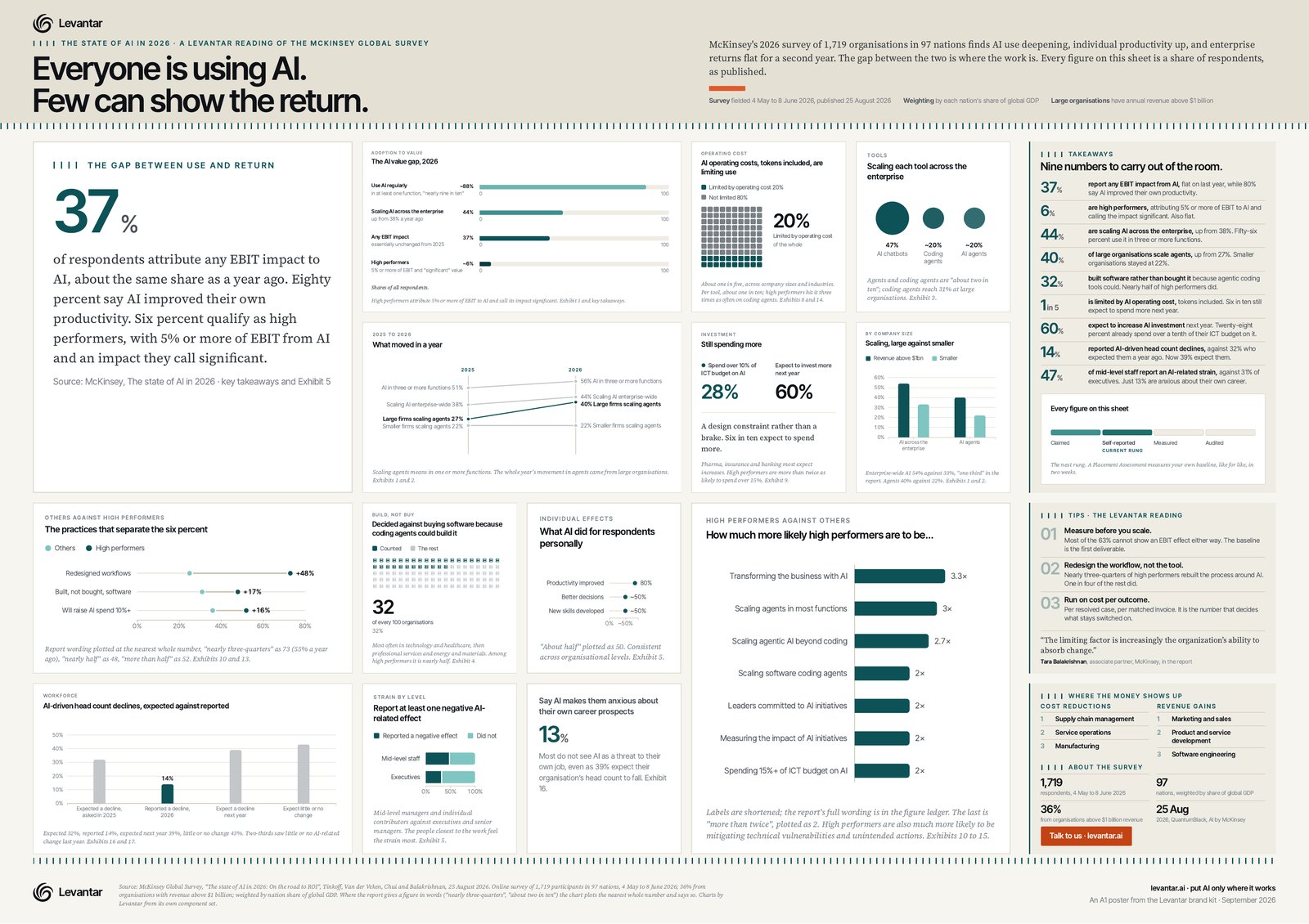
To show it working we picked something real. McKinsey published The state of AI in 2026: On the road to ROI at the end of August. Andy Goundry has already written up what the numbers say, in A year of record AI spending. The value needle didn't move. This sheet is the other half, the whole report on one page. A model read it and took every figure that matters with the sentence it came from. It weighed the whole catalogue against each one and laid the result out on a single A1 sheet. Because every chart is SVG, the sheet is vector from edge to edge. The browser prints it to a PDF that stays vector, so it holds at A1 on a wall and on a phone. The sheet then went through the gates. Every card measured against its grid cell, every word against the voice rules, every figure against the report's own text, and a second model from another vendor reading the figures blind. Then we read it ourselves, a few times over. It is one page from a 31-page report, so it is our reading rather than the whole picture, and a second pair of eyes is always welcome. If you spot something we missed or got wrong, let us know and we will put it right.
The same method, for you
The same method is what we sell. An AI Placement Assessment measures where a model would earn its keep in your business, like for like, in two weeks. An ROI Recovery Sprint takes an AI programme that is not paying back and finds out why. An Application Build makes the thing, under a harness like this one, and an AI Security Review makes sure it stays yours. If you are working out where agents fit, the Agent Readiness Session is where to start.
Download the poster. It is a PDF, vector throughout, so it scales to whatever size you print it at, and it is free. If you are trying similar methods on your own content, we would like to hear how it is going.
Sources
- https://www.mckinsey.com/capabilities/quantumblack/our-insights/the-state-of-ai (McKinsey, The state of AI in 2026: On the road to ROI, 25 August 2026)